Showing posts with label highlight. Show all posts

Monday, July 13, 2009

Painting a Colourful Portrait in Oils – 2

Today, I had my second portrait sitting with Judy lasting around 2 hours. As previously stated I focused on painting her head and hands.


Portrait of a Kenyan Lady


Initially, I concentrated on the eyes. I looked at the shape of the lids, both upper and lower. For the cool highlights on the upper lids I introduced some Kings light blue into my basic fleshtone. The lower lids in the corners were a mixture of raw sienna and alizarin crimson. I again used the light blue as these turned into the light. I darkened the intensity of the pupil and iris with a combination of burnt umber and ultramarine.
I modified the shape of the mouth, widening it slightly. On both upper and lower lips I used a mixture of light blue and rose dore for the highlights. For the shadow cast by the upper lip burnt umber and magenta were emloyed with below this a touch of cadmium red light.
I then tried to soften the various fleshtones in the face. The basic colour was raw sienna +yellow ochre + white. At other times I added a little touch of cadmium red or light blue depending on whether it was warmer or cooler. For the shadow areas, I used ultramarine or magenta mixed into the sienna.
By now, time was running out. Quickly the hands were blocked in using the same mixtures as above, but a lot more cad. red to capture the reflection from the dress.


Detail of Hands


As I said in my previous blog, it was my intention to do more work on the costume prior to today’s sitting. This has been very slow as there is simply no fast way of achieving the effect I want. As you will see I have started blocking in the various patterns. The collar in particular requires a huge amount more work to show how it comprises of hundreds of beads catching the light and is not simply a flat shape. This will be the task for the coming week.


Portrait of a Kenyan Lady ( stage 2)


My next “live” session is on Thursday 23rd when I will be trying to bring head and hands to near completion. I am also considering my options for the background. But more of this in my next blog!

Friday, April 17, 2009

Pastel portraits

When I consider pastels, the words that leap to mind are, freshness, delicacy and spontaneity. It is the closest one can get to drawing and painting at the same time. They don’t require drying time , they don’t “sink” and the colours do not fade.( assuming you treat them carefully)
They have a relatively short history, being popularised in the 18th Century by artists like Quentin de la Tour, Perroneau and Chardin. In the nineteenth, Manet, Degas and Mary Cassatt were the leading proponents.
In this blog, I will demonstrate how I develop a pastel portrait and also show you a few other samples of my pastel work.


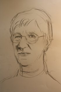
I work on tinted paper, the colour usually determined by the complexion, and character of the sitter. I initially block in with willow charcoal, trying to establish the likeness.
When fairly happy with that, I begin to apply colour.


I usually start with hard pastels, working boldly. It can be a little daunting, (particularly for the sitter), when this patchwork of bright colours appear. But I am thinking ahead, planning what I will overlay to modify them.


Here, I use a variety of techniques. I cross hatch, allowing the original colour to show through. At other times I apply solid pigment and blend with either my fingers, a torchon or soft cloth. As you will see I am now introducing a background, earring and jumper.


The process continues as I modify and adjust the colours and tighten up on the accuracy of my drawing.


” Mrs. Pat Motherwell”
In this final stage, I added stronger highlights and reflected lights on the nose, a bit more detail in the hair, and more modelling on the chin and neck. All that remains is to finish the jumper and necklace.
The following are pastel demonstrations or sketches I have done, usually in about an hour.


“The Commander"


“Young girl”


Pastels are also lovely to use for life drawing


“Peter”
Or, as I demonstrated in an earlier blog, for landscape also.


” Kirkcudbright Harbour”. A pastel drawing of Kirkcudbright Harbour. I did this as a short demonstration in the pastel medium for the group who came on one of our Painting Holidays in the town.
Tips. I use a combination of both hard and soft pastels. The general principal is that the soft are applied over the hard. Any areas, like the eyes where I need a fair amount of precision, I will use only hard pastels, pastel pencils, or conte chalks.